How I Designed My 2017 Christmas Card Range.

It's been forever and a day since I did a creative/illustration based blog post. I don't know if it's what you guys are even in to but I thought it'd be nice to share a little behind the scenes of my business, for those of you who don't know much about what I do, or for those of you who don't know much about the process.
So today I'm sharing a little behind the scenes step by step of how I created my 2017 christmas card range, using my fav design as the example!


I generally work in the same way when I'm illustrating, be that rough sketches, cards, products, doodles or client commissions. It's a method I developed when I was in university in my final year and something I've stuck to since (although I like to think I've got better!)
I start my sketch work with really rough work with a blue pencil. It's a trick animators traditionally learn but basically if you start with a coloured pencil you can then go over it with traditional graphite and then digitally remove the coloured sketch work on the computer in post production. It's a way of starting your sketch without worrying about ruining it, messing it up or being too perfect and it's completely changed the way I draw. I start with very basic shapes, circles and squares and dots for eyes - you can just about make out the sketch lines in the images above.
Next I take a graphite pencil and work over the sketch lines to add more detail and finalise the shape. For these I actually just used a normal HB pencil because I wasn't too worried about the quality of the line but normally I'd use a Palmino Blackwing. My illustration style is all about linework so there's no shading, just outlines in a heavy pencil which makes it easier for me to take to my laptop.
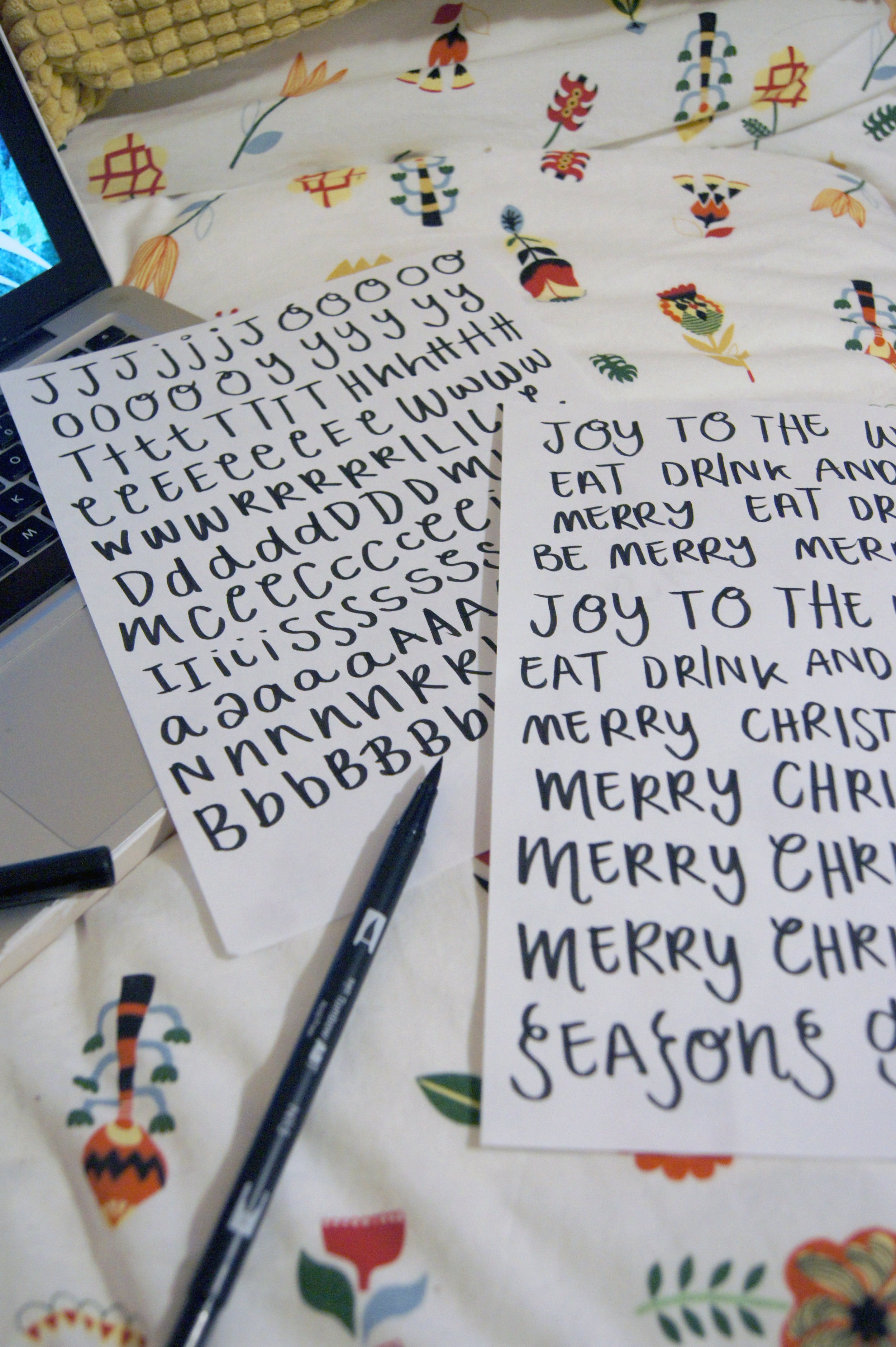

Something I've started thinking about more recently is the typography on my illustrations and it's only this half of the year I have been creating my own fonts out of my handwriting. There are a million and one free fonts you can download and use online which free up the need to use horrible standard computer fonts but lately I've been craving the more personal touch.
It's always been said I have nice handwriting so I invested in a brush pen and set out creating my own fonts. For some things I always think it's best to fork out for top quality equipment but for others, the high street do really great quality cheap versions and brush pens are one of those. I actually bought this one for less than 3 quid on Amazon because I needed it next day and it's brilliant quality - a pure black colour and a decent brush thickness is all you really need.
I wrote out the words I wanted time after time after time to get a version I was happy with but I never quite got all the letters the way I envisaged so in the end I actually drew each letter out on repeat and constructed the words digitally. I'll probably do a whole blog post on hand lettering in the future but the key is to essentially embellish your natural handwriting. An extra flick on the bottom of an N or a curl in a O can really make the difference when it comes to making it your own font and giving it your stamp.


Once I'm happy with the linework and the font I take it all into the computer. I scan my designs (which are on normal copy paper, I've not worked in a sketchbook for years) into my laptop at 600dpi and then take them into Photoshop. It's not a luxury I appreciate everyone can afford but running a business that's 100% focused on design it was a worthwhile investment for me and I have been using the whole Adobe suite since I was 18 now. I exclusively construct and colour my work in Photoshop, which whilst not the platform for everyone, has always been the one I use. It's also worth noting that I use a Wacom drawing tablet -mine is old now but there's similar here - and pen instead of a mouse (but I'm wishing for the iPad Pro if I had a spare gazillion quid).
I start by constructing my cards so I create a new document (this one was 148mmx148mm) and then I play around with adding the different elements of my design. I always always draw the different elements of a design separately so if I don't like something I can edit it out and add in something new, rather than start the whole design again. I recently did a Christmas card commission that involved 32 individual parts.
In Photoshop is where I remove the sketch lines so by making my image CMYK (for print) instead of RGB (for screen) I can edit the channel mixer to suit so I effectively raise how black the black is until it filters out the blue. I don't filter it out completely because my style of illustration is quite sketchy so I like to leave a little summin summin.
Once I've got all the individual elements of illustration onto the canvas I start working in colour. I knew I wanted this card to have a black background so I filled that in first because having such a contrasting colour really affects the tone of colours in the foreground. I use colours I have mixed myself on Photoshop (never the presets) and use my Wacom tablet to fill in the colour. It's a bit like painting by numbers effectively, filling in the shapes and something I've got so used to I never go outside of the lines! I also separate all the elements of my illustration into different layers on Photoshop so in this particular document I had the canvas as the background and then built up the layers with linework at the top followed by colourwork, shadow, tone etc.


After I've added the colourwork I start on the tone. I basically choose a side I think the 'light' would be coming from and add shadow to one side and brightness to the other. The way I personally do it is to pick the colour in the image so for example the gingerbread man. I use the colour picker to choose the biscuity colour and then I pick a colour about 4 shades darker and one 4 shades lighter and use them to add some shadow and highlight. It just brings the image to life and if it wasn't a 'flat' card I would have used a shadow underneath to give each piece some standing.
Once allll the colouring and the tone are done and I'm happy with it all I add the text. Like I mentioned above I actually used individual letters and constructed the words on Photoshop. I'd drawn so many versions of A's and J's etc that I chose the ones I liked the most, with the nicest flick or the nicest weight of line and put them all together to form the words. Although painstaking work I actually liked doing it this way because I was able to bring letters closer together or further away or slightly on a higher line etc. I then edited them from black to white and added a bit of texture to them to make the lines a bit more scratchy. Personal preference.
At this point the Photoshop document is done so I flatten them (compress them) and move them over to InDesign where I create a card document. Basically when you make a card you have the front of the card on the right hand side and the back of the card on the left - the opposite to the way you'd read. This is all for printing purposes but it's worth remembering and I also add my logo and the message inside in this bit.
I export it to PDF for ease and then send it to the company I use for printing! When it's in a big volume like this it's so much easier to send to someone else to mass produce print and they're back with me in a few days! This year for this particular card I decided to make it into a set of 8 with lovely brown kraft envelopes and all boxed up ready for your loved ones!
And that my friends is it! How I designed my 2017 Christmas card range, all tied up nicely with a bow in one handy blog post! Now if you would be so kind as to treat yo self to one.....


