How I Make My Bullet Journal 'Pretty'
Whenever I upload a bullet journal blog post or an Instagram snap I always get a lot of comments on how neat it is, how pretty it is or the odd '#goals' or crown emoji. To me, making my bullet journal aesthetically pleasing is like second nature - I'm an illustrator by trade, designing and drawing is in my job title and weedles it's way into my personal life like it has since I was old enough to colour.
My notebooks in school would be filled with doodles, I could whip up an illustration for someone on a spare sheet of paper in no time and straight lines and things in neat boxes is my jam. You will never see me with some hastily scribbled half crossed out note, a bad choice on the first page of the journal is like a death in the family and I don't even know the meaning of the word 'mistake'.
But in my bullet journal journey I have discovered a lot of you lovely chaps don't have quite the second nature when it comes to making your journal 'pretty' and I get a LOT of requests for advice on how (or just outright requests for me to make my own journals) so with that in mind, here's how I make my journal Insta goals.
Ways I make my bujo pretty (and tips for you);
1. Use your journal format.
I would always recommend a squared journal since making the change from lined but I've seen a lot of people speak highly of the dotted version. Having a squared journal means my journal is immediately more neat and therefore easy on the eye because my lines aren't wonky, grid systems are made up for me already and formatting comes easy.
2. Border and boxes.
A super easy way to make any journal look nice is with a simple box or grid. Personally I don't actually box my text BEFORE I start writing, soz to break it to you but I'm just as bad as you at guesstimating how much space I need so I box in after I've written. Once you've got your text sorted simply draw a box or a border around it and all I do is hash it black and white, colour bits in, dot it...literally so simple.
3. Headers.
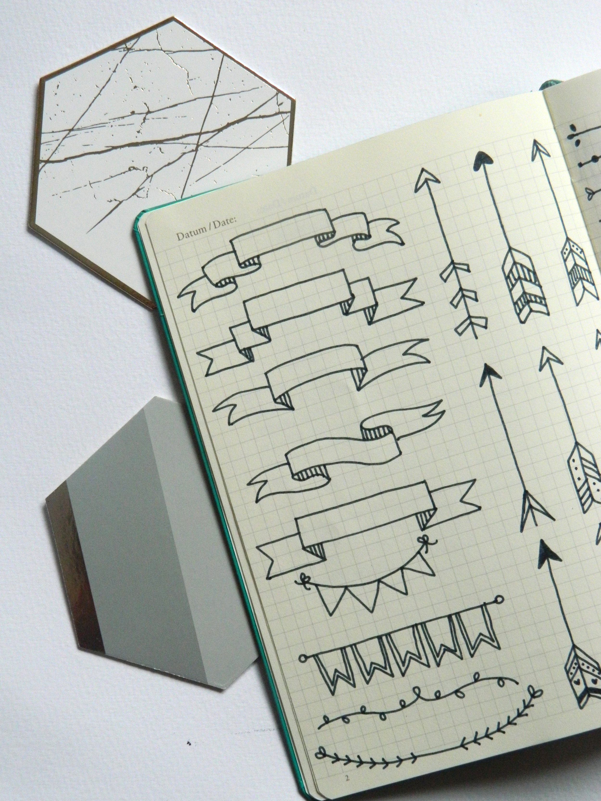
Similarly, a good heading does wonders for your pages overall look. Sometimes I won't do a formal header and sometimes I will, depending on what I'm using that page for - for example I don't for my weekly spreads. Headers can be as simple or as complicated as you make them and I'm going to do a 'how to' post soon but you can see some examples of banners I use for headers in the image below.
4. Hand lettering.
I think pretty typography and nice hand lettering is definitely an element of 'pretty journaling' people struggle with and as illustrative as I am I have to practice too. Fancy or illustrative hand lettering is probably the biggest 'pretty' element of my journal and I have a notebook from my Cratejoy sub box full of my favourite fonts to reference. Pinterest is FULL of hand lettering inspiration but I'd recommend practicing in pencil first if it doesn't come naturally to you.
5. Images.
If you're struggling for the look you're after images always do well for brightening up a page. From scrapbooks of your own life to images that you inspire you could add anything. I have taken to covering up mistakes in pages instead of ripping them out (an eternal error) and I am much happier with how my journal looks. Inspiration pages or mood board are also v Instagrammable.
6. Doodles.
Like I said above, illustrating comes second nature to me and doodling is just par for the course. If there's ever a spare bit of journal or a page is looking a bit sparse I'll add a doodle or two, my current favourites being a border or leaves or some shooting stars. If I'm creating a shopping or a packing list I'll doodle some cars or maps or suitcases, if I have a blog inspired page I'll doodle a computer or a camera or a notebook. If your artistic abilities are uhm, a bit lacking, number 8 in this list might interest you...
7. No crossing out.
This is one of the most simple but effective rules when it comes to making your bujo pleasing to view but I never cross things out. It has to work for your bullet journaling system but for me I don't cross an item out when I have completed the task. Instead, draw small boxes and tick them off or hash them like I do and that way, your journal isn't hampered by ugly lines all the way through your lovely handwriting.
8. Printables.
And if all else fails.....cheat it! There's a million and one printables and things to copy on Pinterest, including the range I designed myself. Just print them out, trace them into your journal and voila - the cutest bullet journal ready for Instagram belongs to you.
Pin me for later!


